Daily Time Tracker
Developing a tool to keep track of what I’m doing at all hours of the day :)

Overview
The daily time tracker is exactly what it sounds like – a way for me to keep track of everything I do on a regular basis, give me insights on how I’m spending my time, and actually keep myself accountable on various aspects of my life, because your calendar doesn’t lie.
Tools
This project was designed in Figma, developed with v0, and powered by Supabase.


pssst…🙊
before diving in to my case study, feel free to give this tool a try yourself at https://dailytimetracker.vercel.app/ and let me know your thoughts! i'm continuously adding to my lengthy to-do list of improvements for this project :)
pssst…🐒
just want to see the end result? click here to view the final product.
Background + Problems
In September of 2025, I started tracking my life in half hour increments after hearing the quote “your calendar doesn’t lie”. It encouraged me to log my day, everyday, in order to see where I was putting my time. I wanted to keep myself accountable but also, in some cases, practice forgiveness by looking at my life through a more objective lens and looking at the bigger picture of my calendar. Also, I love to track things and quantify my life, whether that’s my habits (check out my habit tracker here), my hobbies (peep my goodreads!), or my time.
I manually tracked my life by 11 different categories through a colour-coded excel sheet that functioned off of a vibe-coded apps script for 4 months.

peep the 7 trips I went on during my exchange, marked out in red ;)
There were a few key problems with this:
I was on exchange in Hong Kong during this time, and trying to travel as much as I could. This meant that I was often going hours or even days at a time without access to my laptop, and manually updating an excel sheet on my phone was not fun.
Needing to select cells -> select colour -> fill for each activity was tedious, especially when I was clearing a backlog of activities and had to log multiple activities at once when I didn't have the chance to track in the moment.
My spreadsheet is divided into half hour increments, which meant it was impossible to get a fully accurate tracker. I would round activities to the nearest increment, but that means that 2 minutes and 14 minutes spent on an activity would track to be the same.
Process
After identifying my pain points and noticing them in my routine more and more, I started dreaming of a way to automate this process as much as possible - I wanted it to be easier to track my time, more user-friendly for busier days, more time accurate, and cuter!
I started by looking into ways to bring my idea to life - I didn’t want to just design this idea, I wanted it to actually work and replace my current process. After exploring a few different AI development platforms such as Lovable and Claude, I settled on v0 for its ease of use and because the University of Waterloo is part of their students program, which offers one year of free v0 premium.
When I first got started on v0, I got ahead of myself and sucked in to prompting and prompting and prompting, excited to see how fast working with AI was and how many things I could dream up. Of course, this meant that I eventually needed to go back to the beginning and follow an actual design process, learn how to make more guided prompts, and prioritize my features after learning the hard way about how fast credits get used up :')
Early Iterations
The first version of the daily time tracker was simply an attempt to recreate my excel spreadsheet and make the activity tracking process a little easier.
I struggled with getting the calendar alignment and synchronized scrolling in place, going back and forth between ChatGPT and v0 many times to determine the proper terminology in order to make my prompt as accurate, detailed, and efficient as possible. After fixing the alignment, I rethought what my next steps were and realized I had approached this project the wrong way. With a dream and no plan, I went back to the drawing board.
I needed to get a better idea of the best way to streamline the time-tracking process and also figure out what types of features I needed to include, so I created a user flow diagram to visualize the step by step process I would take.
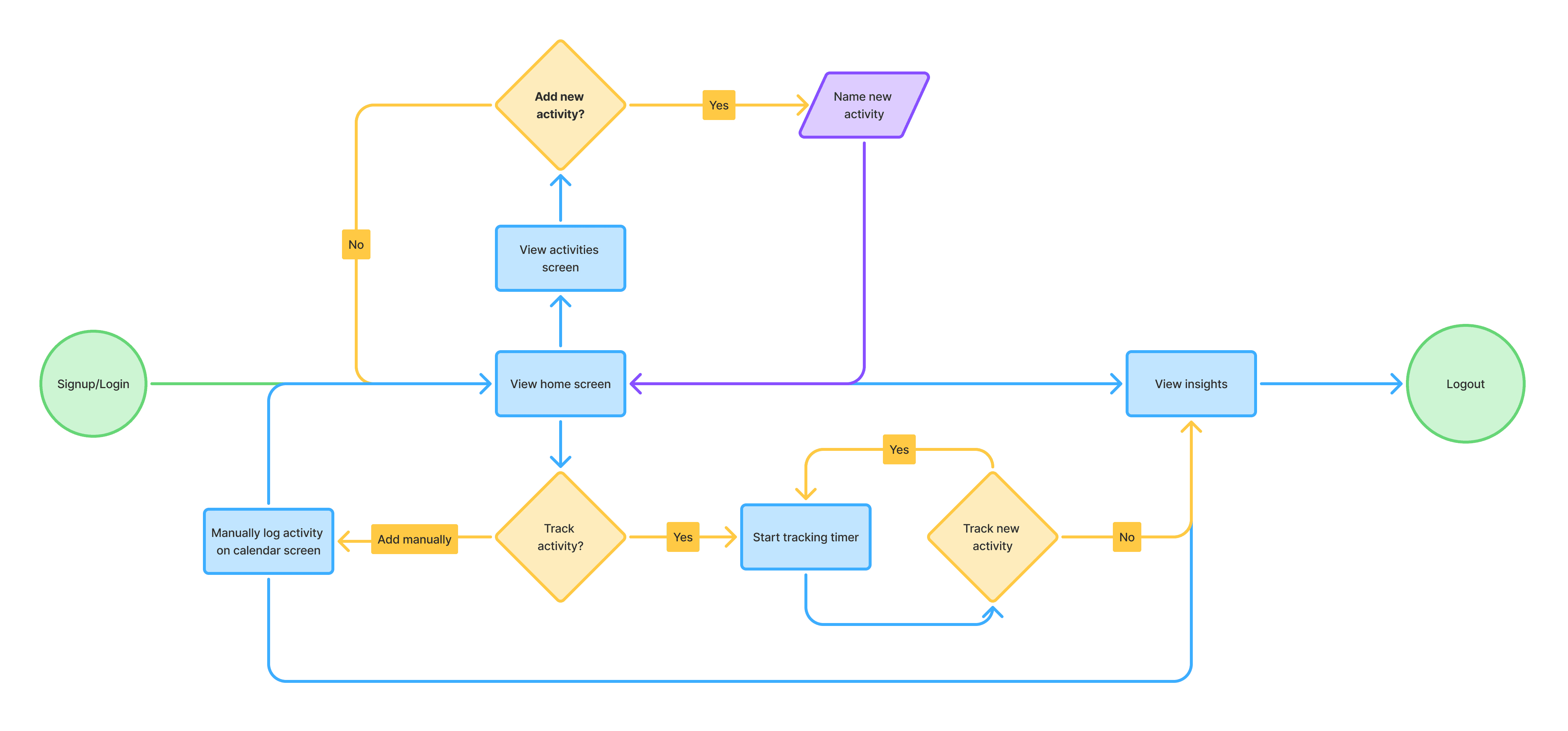
Inspired by the lap feature in clocks, I wanted to implement a similar stopwatch-style tracker that lets me track different activities easily throughout the day, whenever I start or stop them. All I would need to do is select an activity for it to automatically start tracking, and starting a new activity automatically stops the current one, so I don't have to manually stop each activity.
After deciding on key features, I took it over to v0 to see what it would come up with and to give myself a new starting position to work with. I also wanted to make sure the layout could translate over easily to a mobile version in order to tackle my first pain point and enable time tracking on my phone.
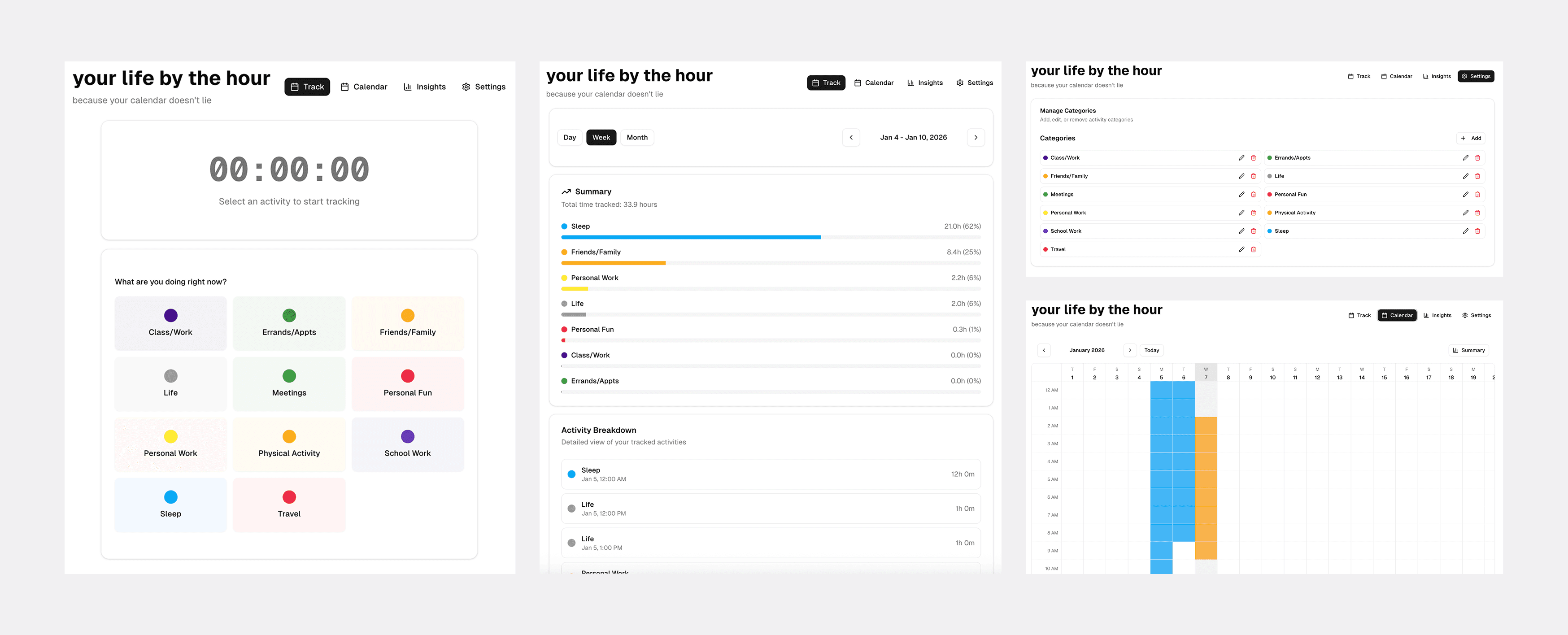
it successfully implemented a stopwatch style tracker, added basic insights, and fixed the calendar functionality
Integrating Design > User Testing > Bug Bashing 🐛
I was satisfied with the framework, so from here on out I worked on fixing up the functionality and applying my designs. I wanted something bright and bubbly, so I first created a few rough designs based on the sun and the idea of time passing throughout the day. Eventually I settled on a few elements I wanted to include, deciding on the font, colours, and assets.
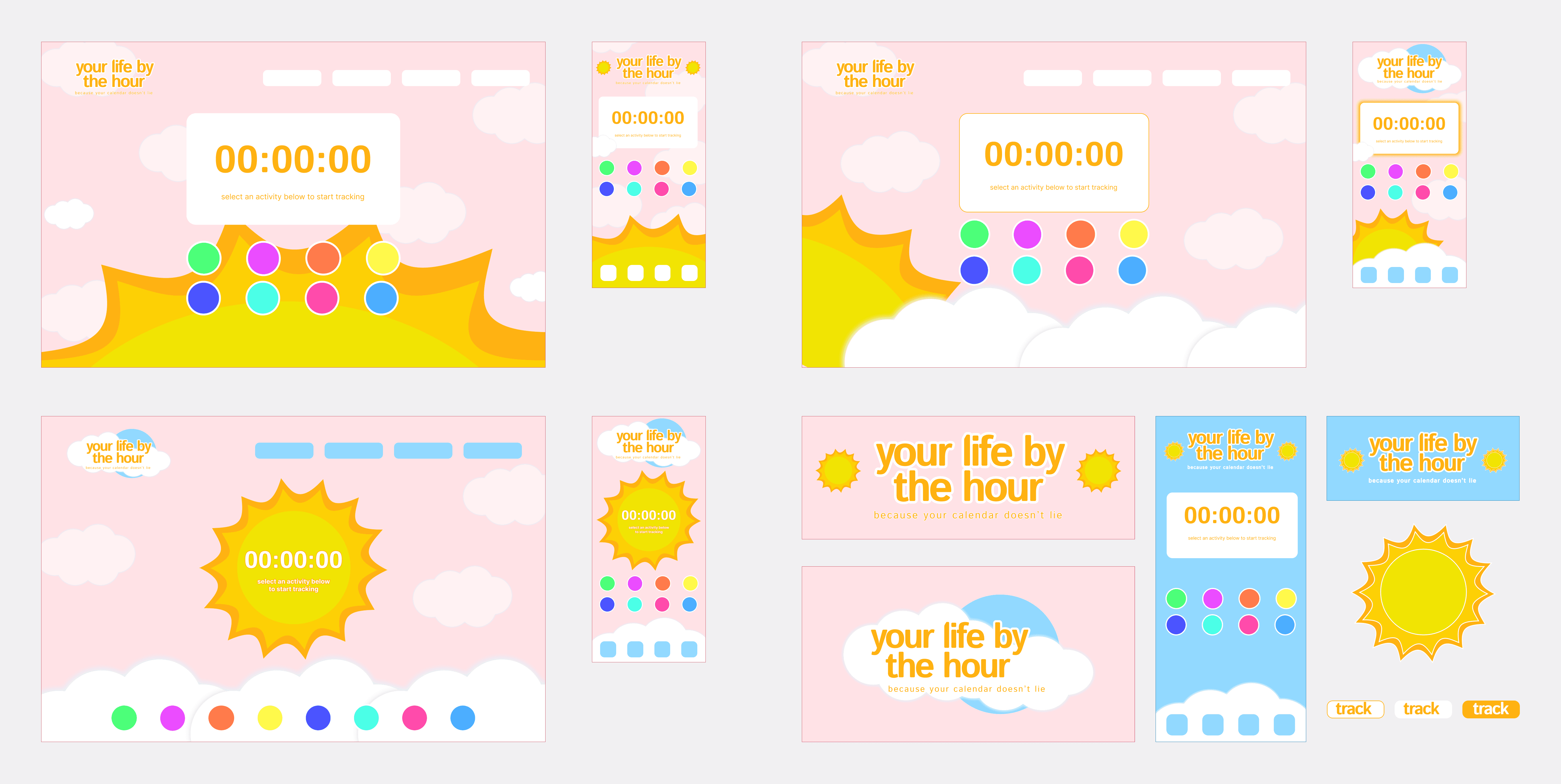
the purpose of these mocks was just to lay out assets, colours, and create a visual for myself!
I started off with a very pink palette, layering on complimentary yellows, oranges, and blues to find colours that for the sun and sky. When I first implemented this colour palette in v0, it was a lot harsher on the eyes than I had expected and was uncomfortable to look at for long periods of time. This compelled me to switch over to the calmer and darker blue tone, which also helped with the contrast of elements on the screen. I looked for ways to integrate the sun asset into the tool that would translate over well on a mobile screen and eventually settled on adding it to the title to reduce clutter in the background.
Bringing the elements over to v0 was a huge learning process, and I explored with prompts in Figma Make as well to understand how different tools interpret screenshots and links. I learned that v0 is not great at recreating assets but is really good at ensuring layout and responsiveness work well, so I uploaded my assets as .svg files and worked with v0 more so on the functionality of the platform.
My goal at this point was to add a design to the tool, but primarily to focus on the usability and user experience still. I was eager to use this tool for myself and I knew that after settling on a design vision I could always keep working with it to slowly implement aesthetic changes.
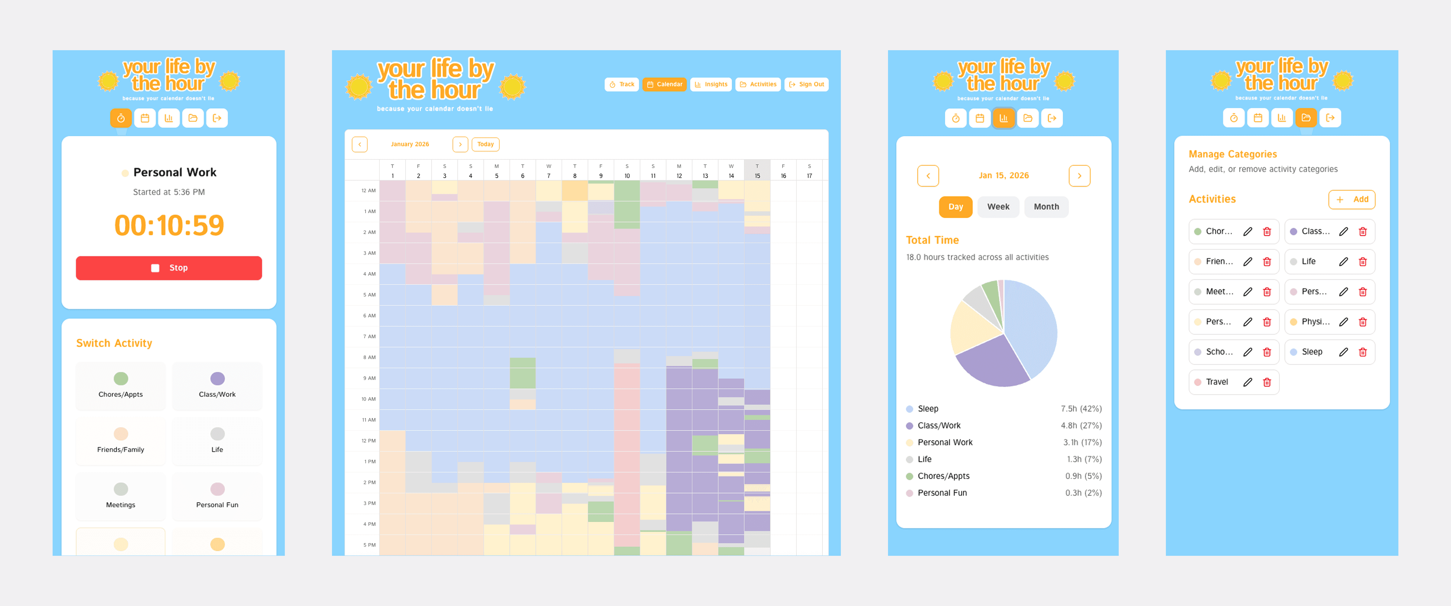
Tracking activities is a mobile-first screen, and I find myself using it a ton throughout the day to quickly switch my logged activity. Insights and editing activities are also both fully functional on mobile and are convenient to edit quickly or check how my day is progressing. For the calendar view, I prefer to use a larger screen in order to see my week or month at a glance, but viewing on mobile is an option for users as well.
Once the designs were implemented and I was ready to start sharing my work with others for feedback, I connected things to Supabase and implemented authentication so that anyone can make an account and get started. I was excited to share, so I sent the link out to friends and family and hopped on FaceTime calls with them. They screenshared so I could see their live reactions and how they interact with the tool, and what started as a way to show what I had been working on turned into valuable user testing sessions where I took away many points of improvement.
Improvement #1: Deletion of Activities
The first thing mentioned through my calls were the lack of a delete function for activities tracked on mistake. I originally hadn't included a delete function because manually selecting cells to track new activities over existing ones would successfully overwrite them, but users pointed out that if accidentally added an activity a few days in advance, not being able to delete it would mess up the accuracy of their weekly and monthly insights.
ORIGINAL
The original flow lacked the option to delete or edit activities, both being unforgiving of mistakes and limiting the flexibility users had with their activity log.
UPDATED
By adding in an extra modal before a user can successfully add an activity, this also further minimizes the chance of an accidental activity log.
Improvement #2: Creating & Editing Activity Colours
Secondly, the colour selection on the original design was overwhelming and difficult to use. Colours were not sorted or categorized in an intuitive manner, making it difficult to skim or decide on a colour quickly. Editing the colour of an existing activity also only displayed a limited number of shades of the original colour rather than showing the full palette, limiting selection choice.
In my updated version, I followed a more organized colour matrix organized by columns (tints and shades) and rows (hues). Editing an existing activity's assigned colour also opens up the full colour picture for maximum customization.
In future iterations, I would love to implement a more complex colour picker with a saturation-brightness square and an option for users to find colours through HEX codes and other colour formats.
ORIGINAL

UPDATED

Improvement #3: Re-rendering Calendar Edits
The third improvement was based on the reload of the calendar screen once an activity was added. I was unable to capture a demo of the original due to having deleted the data of old versions in v0 in order to test new versions, but every time the calendar was manually updated with an activity the entire screen would reload. This was inconvenient for users who needed to edit many activities at once, users who just wanted to play around and explore the tool at first, and added unnecessary friction to the user flow.
In the updated version, I worked on fixing the re-rendering of the calendar when making edits. Now, when adding or deleting activities, only the grid cells of the calendar will re-render, leaving the headers untouched.
In the future, my goal is to implement hot reloading for a faster and more seamless experience.
UPDATED
Final Designs (for now)
The daily time tracker still has a long way to go, and I’ve been steadily chipping away at different interactions and features on my long list of things to improve. However, my original goal of replacing the Excel sheet has come true and since early January I’ve been tracking my time entirely through the daily time tracker.
an overview demo of the different screens and functionalities
a more in-depth demo focused specifically on activity tracking!
Learnings + Next Steps
WHAT IS A GOOD PROMPT?
One of the biggest and newest things I learned was how to prompt effectively! I learned way more than I expected about how my prompts are interpreted, how to prevent redundancy, and the power of providing the right kinds of context. Working through problems with v0 and seeing how approaching the same problem differently could prompt different solutions forced me to understand my own problems better. I gained a better understanding of how to ask the right questions by understanding how v0 and the development process works.
FOUNDATIONS FIRST
I learned a lot about how to efficiently approach a problem from scratch — working with different AI tools is fast and that's great, but it's still necessary to have a clear foundation of what I'm actually trying to build. Combining the design thinking and processes from my previous experiences and the skills I learned from playing around in v0 together taught me a lot about where I can streamline my process and how to decide between v0 and Figma (or even pen and paper) for each task.
HOW TO PRIORITIZE FEAUTRES
As I keep using the Daily Time Tracker for my own use, I keep gathering new features and functionalities I'd like to see — but when I think about all of them together, I realize that a lot of them would conflict with the usability of a separate function. While continually working on this project, I am learning more and more about how to prioritize features and make these judgement calls :)
NEXT STEPS
The next steps for this project are to bring over more of my designs and push the boundaries of what I've been able to create so far with v0, as well as continue fixing different bugs! Additionally, I'm always thinking about ways to integrate the tracker more into my own life and searching for places to lighten the load on the user even more.
