Habit Tracker Punch Cards
A punch-card style habit tracker maker that visually rewards consistency!
Overview
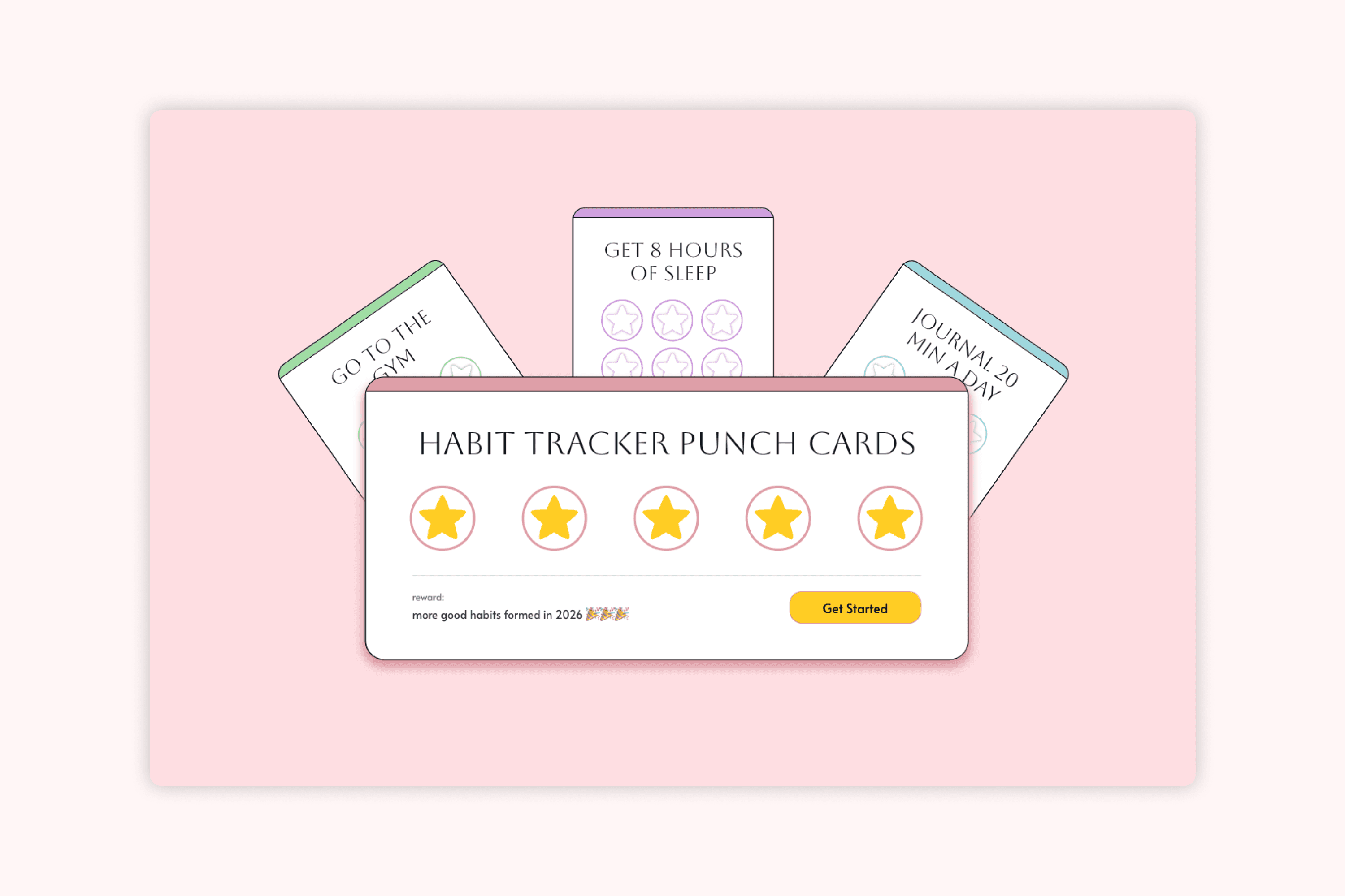
The habit tracker is a tool to create digital punch cards in order to track your habits over the course of a week. Users can customize the habit to track, add an associated reward, and choose from a few different presets of designs. This tool keeps users accountable on a week by week basis, using visuals and rewards to help build long-term habits.
Tools
This project was designed in Figma and developed in Figma Make!


pssst…🙊
before diving in to my case study, feel free to explore this tool yourself at https://weeklypunchcards.figma.site/ and let me know your thoughts! i'm curently working on implementing further design changes and connecting to a backend :)
pssst…🐒
just want to see the end result? click here to view the current implementations.
Background
When 2026 rolled around, I started seeing a new trend pop up on social media; habit tracker punch cards for your New Year's resolutions! People were making their own punch cards, similar to the rewards cards you get from stores, in order to create incentives to stay consistent with their habits on a weekly basis.

@emiliamariehome on instagram
I thought this was a cute way to visually see your habits as well as treat yourself for a job well done and wanted to make some for myself. The problem was, nobody wanted to make them with me, and I like to do physical arts and crafts as a social activity. Therefore, I decided to digitize the idea so that people could use it as a tool without committing to the physical arts and crafts aspect.
Process
With the habit tracker, my initial idea was to create a customizable prototype in Figma so that anyone interested in creating a habit tracker could copy the file and create their own punch card. The problem with this was figuring out how to create an actually useful product when everything about the habit tracker could be customized - from the habit, the number of days, the reward for completion, to every element of the design such as font, colour, assets, there were too many customizable features for one prototype to make sense. I wanted this to be something that anyone not interested in designing a cute card but still wanted the functionality could use, and having it be fully customizable design-wise put the pressure on the individual to basically do all the work.
From there, I decided to pivot into creating a tool to allow people to create punch-card style habit trackers by choosing between presets. This also allowed me to explore more than just the punch card, exploring how to display multiple cards, adding in an archive of old habits, and being able to set up recurring punch cards so that the platform could be used for as long as the user desires. Having previously explored v0 when creating my Daily Time Tracker, I wanted to work with something else this time around and switched over to Figma Make.
My process was cyclical; I started with a prompt, created a design, and kept going back and forth to bring my design to life while working on functionality.

I spent around half my time designing and half my time implementing!
Early Iterations
The first version of the habit tracker punch card was to see what Figma Make could do. I gave it a prompt to create exactly what I wanted as a mobile-first device, but later this changed to a web-based tool. I ended up with this:
After this first prompt, the layout and flow that Figma Make created provided me with a more clear starting place for an ideal user flow. I pinpointed some of the problems I encountered while testing it out and made a list of functionality fixes and changes I wanted to make.
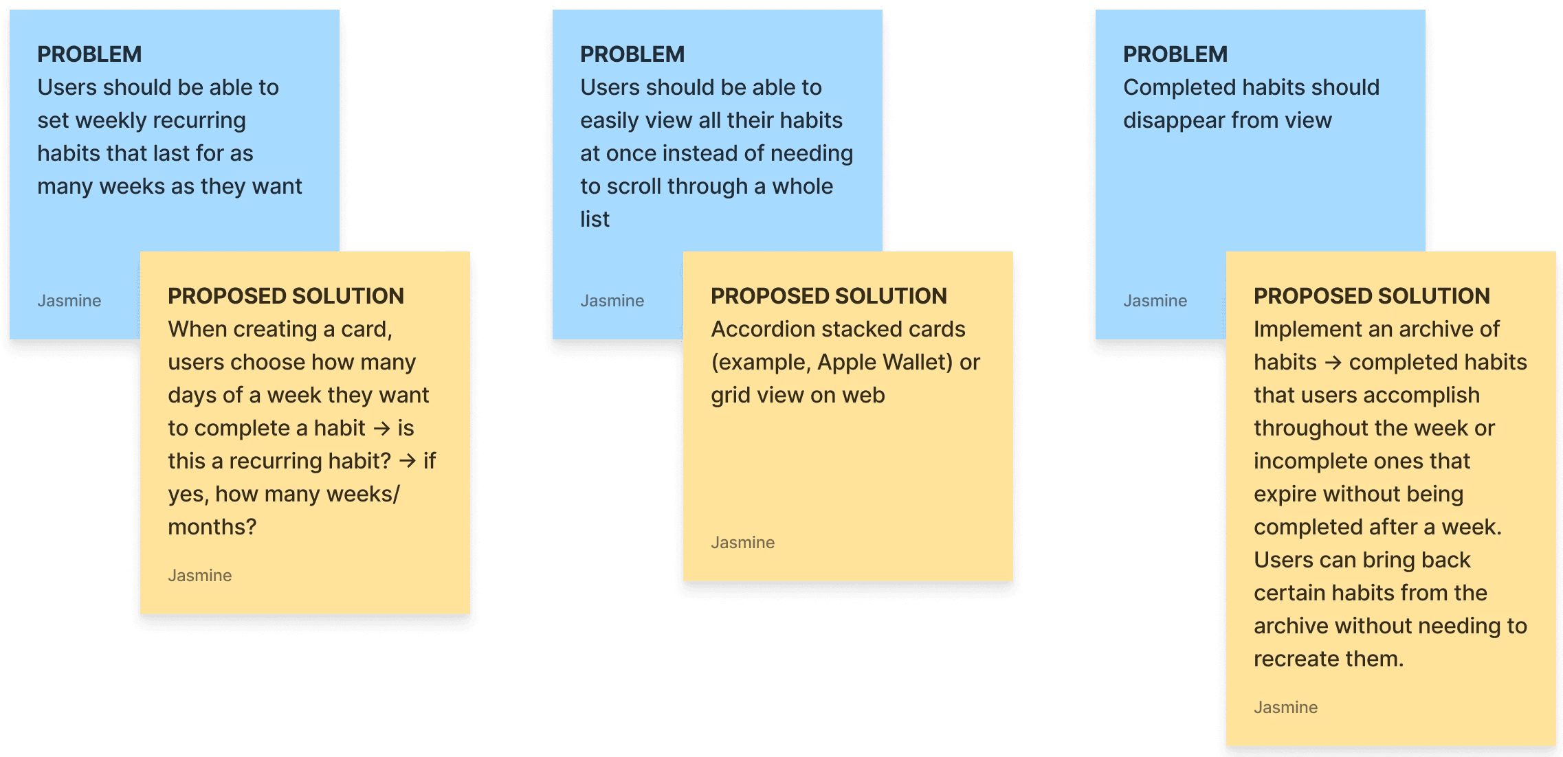
some of the biggest problems and proposed solutions I identified after v1
One of the biggest features I wanted to implement at this stage was the personalization options for users to decorate their punch cards however they wanted. This was an important feature because the visual appeal was what made the habit tracker punch cards fun for users and what had caused the trend in the new year to take off across social media.
I decided on creating presets for card decorations such as colours, background patterns, and emoji icons to decorate the cards, aiming to prioritize ease of use for users and minimizing the amount of time it takes to actually personalize a card — no drawing, no uploading images, or finding their own assets. Building out a well-rounded personalization feature that focused on choosing between provided options rather than designing a new card reduced the amount of work the user would need to do in order to have a cute, functional punch card.
early versions of the first proposed solutions and a personalization feature
There were a lot of issues at this stage with the functionality, the UX, and the visual aspect of the punch cards. A lot of features were buggy and needed further tweaking, but at this point I was satisfied with the overall framework and felt I had enough to go off of to take a break from Figma Make and move over to Figma to create a more concrete design.
Design Considerations
In Figma, I started off by deciding on a basic design system (fonts, colours) before creating a landing page and card components for the punch cards. My goal was to spend as little time in Figma as possible working on prototypes and iterations, and optimize for what tasks were best suited to be done in Figma versus Figma Make.
I prototyped a quick landing screen, created card components, and established a colour palette
Working in Figma on the punch cards also let me think more about how to improve the personalization feature — building out the cards provided more clarity on which sections were worth personalizing and which design features had the biggest impact on the overall appearance of the card.
ORIGINAL
The original personalization option of dragging and dropping emojis left the card looking cluttered, did little for the overall design of the card, and virtually served the same function has having a background preset.
UPDATED
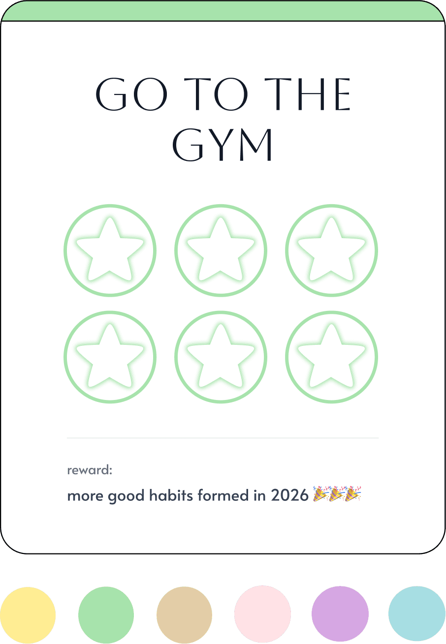
Checking off the punch card to reveal a specific emoji is a cleaner option to customize each card and also more similar to the design of the New Year's punch cards that inspired this project, where the punches correspond to the habit.
Implementations (for now)
This project is nowhere near done — I have a steadily increasing list of improvements, fixes, and tasks to do, but in the current version of the project I was able to implement my landing page prototype, aligning the card component to my Figma mocks, and create a habit tracking interaction I'm happy with.
Next Steps
Some of the major next steps I'll be tackling are:
Improve the UX and layout of creating a card to reduce cognitive load and improve flow.
Applying consistent styling to all pages and fixing UI bugs
Fixing archive functionality (storing archived cards and restoring old habit cards)
Connecting to a backend and adding auth so anyone can use it!
Keep an eye out for future updates on this project :)
Learnings So Far
MICROINTERACTIONS
How microinteractions can change not just the user experience but also the interface design of a product. With the punch card interaction, re-imagining how to apply personalization features in a way that both improves the visual design and adds to the user experience when using the product was something that I was only able to learn after going through multiple trial and errors between Figma Make and my own designs.
TURNING PHYSICAL PRODUCTS INTO DIGITAL EXPERIENCES
Thinking through this project from start to finish (as finished as it is right now, at least!) was a test in my ability to translate physical, real-world interactions over to digital ones. Analyzing where the enjoyment came from with creating physical punch cards and how to replicate that experience on a screen forced me to think more about the entire process of creating a punch card — what are the pain points that I want to cut out when digitizing it versus the strengths that I want to emphasize? I learned
